MCAST Mobile App
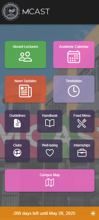
A student-focused mobile app concept designed to make academic information easier to access. The case study now presents the screens as a flowing product story instead of placing the explanation into repeated boxes.
A practical app concept built around everyday student needs.
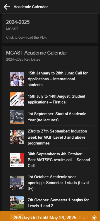
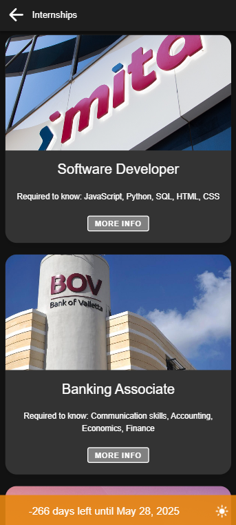
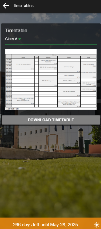
The app brings important areas such as calendars, timetables and internship information into a simple interface. The layout is designed to reduce clutter and make each screen easy to understand at a glance.
Small screens need stronger decisions.
For mobile interfaces, every piece of content competes for space. The design process focused on clear grouping, comfortable spacing and obvious navigation so the app feels useful without becoming crowded.
Identify student tasks
I focused on common student actions, such as checking timetables, looking at events and finding internship information.
Design the screen hierarchy
Each screen was treated as a separate moment with one main purpose, helping the app stay organised and easier to scan.
Polish the presentation
The portfolio page uses angled phone previews and layered visual sections to make the mobile work feel more interactive and professional.